
Less friction. More flow.
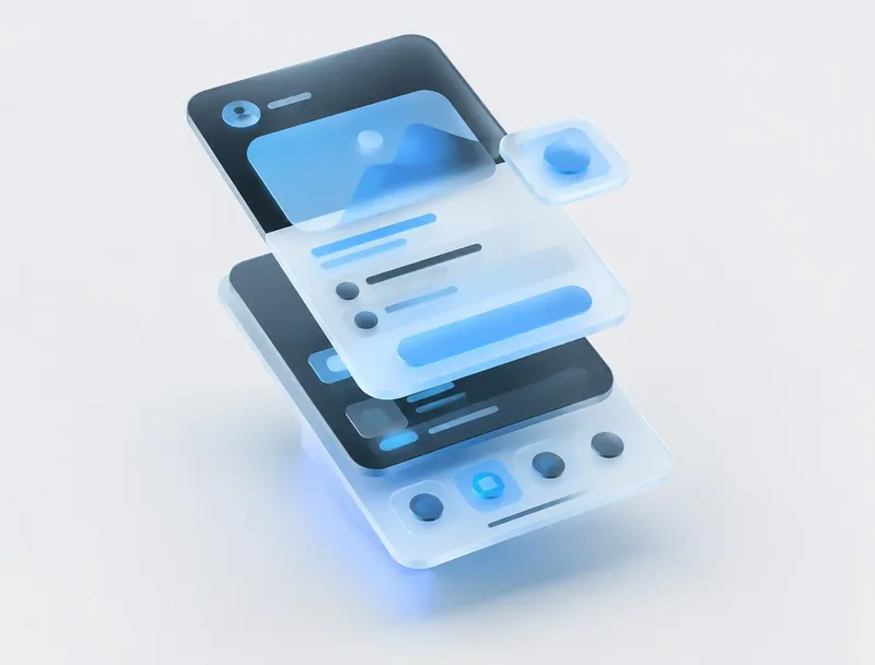
A mobile interface study in clarity, hierarchy, and interactions that feel natural on a smaller screen.
Design exploration. No client engagement or measured business results are implied.
The question
Give each screen a clear purpose while keeping useful information within easy reach.
Our approach
- 01Prioritise one primary action per screen.
- 02Use consistent spacing, touch targets, and navigation.
- 03Build a component language that can extend to new features.
What the concept explores
This study explores a reusable interface language, with visual detail supporting the task rather than competing with it.
Your next chapter starts hereThe next chapter?
The next chapter?
Let’s build it together.
A new website. A better product.
A problem worth solving. We’re listening.